
Introduction
Many businesses collect large amounts of data every day, but most of it remains unused because raw numbers alone are difficult to understand. Without data visualization, spreadsheets full of figures fail to reveal patterns, trends, and insights that are critical for growth. This is why relying only on raw data often leads to confusion and poor decision-making instead of clear business direction.
An Advanced Analytics Guide: Data Visualization & Reporting helps transform complex data into simple, visual formats that are easy to interpret. Advanced analytics focuses on using techniques like charts, graphs, and dashboards to present meaningful insights. With effective data visualization, businesses can make smarter decisions, identify opportunities faster, and improve reporting clarity. In this guide, you will learn how advanced analytics and data visualization work together to deliver better insights and support data-driven decision-making.
What Is Advanced Analytics and Why It Matters
Advanced analytics refers to the use of sophisticated techniques such as predictive modeling, machine learning, and statistical analysis to examine data and uncover deeper insights. Unlike traditional reporting, it goes beyond describing what has already happened and focuses on predicting future outcomes and guiding smarter decisions through data visualization and analysis.
The main difference between basic and advanced analytics is that basic analytics focuses on simple summaries like totals, percentages, and historical reports, while advanced analytics explores patterns, trends, and future predictions. In a modern business environment, advanced analytics plays a key role in decision-making by helping organizations understand customer behavior, market trends, and operational efficiency at a deeper level.
Business Intelligence (BI) acts as the bridge between raw data and meaningful data visualization. It connects data collection, analysis, and visualization tools to create clear dashboards and reports. Through this integration, BI helps businesses transform complex datasets into easy-to-understand visuals, making decision-making faster, more accurate, and more strategic.
Data Visualization in Advanced Analytics Explained
What is data visualization?
Data visualization is the process of converting raw data into visual formats such as charts, graphs, and dashboards. In data visualization, complex datasets are transformed into simple visuals that make it easier to understand relationships, patterns, and performance without needing to read large amounts of raw numbers.
Why visualization is important
Visualization is essential in data visualization because it allows users to understand complex information quickly and clearly. Instead of analyzing rows of data, decision-makers can instantly see trends, compare performance, and identify insights. It also improves decision-making by making data more accessible and helps businesses detect patterns and changes that might otherwise go unnoticed.
Types of data visualization techniques
There are several common techniques used in data visualization. Bar charts are used for comparisons, line charts help show trends over time, and pie charts display proportions. More advanced methods include heatmaps for intensity analysis, scatter plots for relationship mapping, and interactive dashboards that allow users to explore data dynamically and gain deeper insights.
Advanced Data Analytics and Visualization Tools
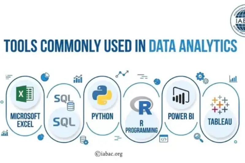
Modern data visualization depends heavily on powerful tools that help transform raw data into meaningful insights. These tools range from beginner-friendly platforms to advanced programming-based solutions, each serving different business and analytical needs.
Tableau
Tableau is one of the most popular tools for data visualization and business intelligence. It is best for creating interactive dashboards and visual reports. Tableau is suitable for both beginners and advanced users, but it becomes especially powerful in enterprise-level analytics where deep data exploration is required.
Power BI
Microsoft Power BI is a widely used Microsoft tool for data visualization and reporting. It is best for businesses that want easy integration with Excel and other Microsoft products. It is beginner-friendly but also supports advanced analytics features for professional reporting and dashboard creation.
Google Looker Studio
Google Looker Studio is a free tool for creating data visualization dashboards. It is best for marketers and small businesses who need simple, cloud-based reporting. It is highly beginner-friendly and ideal for connecting multiple data sources like Google Analytics and Google Ads.
Python (Matplotlib, Seaborn)
Python, along with libraries like Matplotlib and Seaborn, is used for advanced data visualization and data science projects. It is best for developers and data analysts who need full control over data processing and custom visualizations. It is considered an advanced-level tool.
Excel Advanced Dashboards
Microsoft Excel is one of the most accessible tools for data visualization. It is best for beginners and business users who want to create simple charts, pivot tables, and dashboards. With advanced features like Power Query and Power Pivot, it also supports more complex analysis.
How to Create Effective Data Reports and Dashboards
Creating strong data visualization reports and dashboards is not just about adding charts—it is about presenting data in a way that supports clear decision-making. A well-structured dashboard helps businesses understand performance quickly and act on insights without confusion.
Define your goal first
Before building any report, you must define the business objective. In data visualization, clarity starts with purpose. Whether your goal is to track sales, monitor user behavior, or measure marketing performance, knowing the objective ensures your report stays focused and relevant.
Choose the right KPIs
Selecting the right Key Performance Indicators (KPIs) is critical. In data visualization, too much data can create confusion instead of clarity. Focus only on meaningful metrics that align with your business goals and avoid unnecessary data overload.
Structure your dashboard
A well-structured dashboard improves readability and decision-making. In data visualization, important metrics should always appear first, followed by supporting data. A simple, organized layout ensures users can quickly understand key insights.
Use visuals instead of raw data
Charts and graphs are far more effective than raw tables. In data visualization, visuals help users identify trends, patterns, and comparisons instantly. This makes complex data easier to interpret and more actionable.
Make reports interactive
Interactive dashboards improve user experience and analysis. In data visualization, features like filters, drill-down options, and dynamic charts allow users to explore data more deeply and customize insights based on their needs.
Best Practices for Data Reporting and Storytelling
In data visualization, reporting is not just about showing numbers—it is about communicating insights in a clear and meaningful way. Effective reports and dashboards help decision-makers quickly understand performance and take action without confusion.
Keep reports simple and clear
Simplicity is one of the most important principles in data visualization. Avoid adding unnecessary charts, metrics, or complex layouts. A clean and focused report helps users understand key information quickly and reduces the risk of misinterpretation.
Focus on insights, not just data
Good reporting is not about presenting raw numbers; it is about explaining what the data actually means. In data visualization, every chart or metric should answer a question or highlight an insight that supports better decision-making.
Use storytelling with data
Storytelling makes reports more powerful and easier to understand. In data visualization, a strong structure like Problem → Insight → Solution helps guide the audience through the data and clearly explains the business impact behind the numbers.
Use consistent formatting
Consistency improves readability and professionalism. In data visualization, using the same chart styles, colors, and layout structure across all reports helps users easily interpret data and compare results over time without confusion.
Business Intelligence and Data Visualization Guide
Business Intelligence (BI) refers to the technologies, processes, and strategies used to collect, analyze, and present business data in a meaningful way. In data visualization, BI plays a key role by transforming raw data into clear reports, dashboards, and visual insights that support better understanding of business performance.
The role of BI in analytics is to help organizations make sense of large and complex datasets. Through data visualization, BI systems convert data into visual formats that make trends, patterns, and key metrics easier to interpret. This allows businesses to monitor performance, track goals, and identify opportunities for improvement more efficiently.
BI tools significantly improve decision-making by providing real-time insights and interactive dashboards. In data visualization, these tools help managers and analysts quickly access important information without manually processing data, leading to faster and more accurate decisions.
The connection between BI, reporting, and visualization is very strong. BI collects and processes data, reporting organizes it into structured formats, and data visualization presents it in an easy-to-understand visual form. Together, they create a complete system that supports smarter, data-driven business strategies.
You may also read this:
👉 What Are Blog Tags and How to Use Them – Complete Guide (Bluleadz)
👉 Understanding Blog Categories and Tags – Harisundar Guide
👉 dbt Insights Blog Category – Analytics & Data Insights (dbt Labs)
👉 Top Data Analytics Blogs You Should Follow – CareerFoundry
👉Analytics Mania – Google Tag Manager & Google Analytics Blog
Common Mistakes in Data Visualization and Reporting
Even with advanced data visualization tools, many businesses fail to get accurate insights because of poor reporting practices. Avoiding these mistakes is essential for creating clear, effective, and actionable dashboards.
Overloading dashboards with data
One of the most common mistakes in data visualization is adding too much information in a single dashboard. When reports are overloaded with metrics, charts, and numbers, it becomes difficult to focus on what truly matters. A cluttered dashboard often leads to confusion instead of clarity.
Using wrong chart types
Choosing the wrong chart can completely misrepresent data. In data visualization, each chart type has a specific purpose—for example, line charts for trends and pie charts for proportions. Using incorrect visuals can lead to misinterpretation of important insights.
Ignoring audience needs
Effective reporting depends on understanding who will use the data. In data visualization, a technical audience may need detailed analytics, while business users prefer simplified dashboards. Ignoring audience needs reduces the effectiveness of the report.
Not updating reports regularly
Outdated data leads to poor decisions. In data visualization, reports must be updated regularly to reflect current performance. Without fresh data, dashboards lose their value and fail to support real-time decision-making.
Future of Advanced Analytics and Data Visualization
The future of data visualization is rapidly evolving as businesses move toward faster, smarter, and more automated ways of understanding data. Traditional reporting is being replaced with intelligent systems that not only display information but also generate insights in real time.
AI-powered dashboards
Artificial Intelligence is transforming data visualization by creating dashboards that automatically analyze data and highlight key insights. These AI-powered systems can detect patterns, suggest actions, and reduce the need for manual analysis, making decision-making faster and more accurate.
Real-time analytics
Real-time analytics is becoming a standard in modern data visualization. Instead of waiting for daily or weekly reports, businesses can now monitor live data updates. This allows companies to react instantly to changes in performance, customer behavior, or market trends.
Predictive analytics
Predictive analytics takes data visualization a step further by forecasting future outcomes based on historical data. It helps businesses anticipate customer needs, sales trends, and potential risks, enabling proactive decision-making instead of reactive responses.
Automation in reporting
Automation is simplifying data visualization by reducing manual reporting tasks. Reports and dashboards can now be generated automatically, updated continuously, and shared across teams without manual effort. This improves efficiency and ensures data accuracy at all times.
Conclusion
Advanced analytics has become a critical part of modern business success because it turns complex data into clear, actionable insights. With the help of data visualization, organizations can move beyond raw numbers and truly understand what is happening in their operations, customers, and markets. This leads to more accurate forecasting, better performance tracking, and stronger strategic planning.
The importance of visualization and reporting cannot be ignored in today’s data-driven world. Effective data visualization makes information easier to interpret, while structured reporting ensures that insights are communicated clearly across teams. Together, they help businesses make faster and more confident decisions based on real evidence rather than assumptions.
Now is the time to take action. Start using data visualization and advanced analytics effectively in your business today, and turn your data into smarter decisions that drive growth, efficiency, and long-term success.
Frequently Asked Questions (FAQs)
1. What is advanced analytics in data visualization?
Advanced analytics in data visualization refers to using complex techniques like predictive modeling, machine learning, and statistical analysis to turn raw data into meaningful visual insights such as dashboards and reports.
2. Why is data visualization important in business?
Data visualization is important because it helps businesses quickly understand complex data, identify trends, and make faster and more accurate decisions.
3. What are the best tools for data visualization?
Popular tools include Tableau, Microsoft Power BI, Google Looker Studio, Python (Matplotlib, Seaborn), and Excel advanced dashboards.
4. What is the difference between basic and advanced analytics?
Basic analytics focuses on historical data and simple reports, while advanced analytics uses deeper techniques to predict future outcomes and uncover hidden patterns.
5. What is Business Intelligence in data visualization?
Business Intelligence (BI) is the process of collecting, analyzing, and presenting data using dashboards and reports to support better decision-making.
6. How do dashboards improve decision-making?
Dashboards improve decision-making by presenting key metrics visually, allowing users to quickly understand performance and take action based on real-time insights.
7. What are common data visualization techniques?
Common techniques include bar charts, line charts, pie charts, heatmaps, scatter plots, and interactive dashboards.
8. What are the best practices for data reporting?
Best practices include keeping reports simple, focusing on insights, using storytelling, and maintaining consistent formatting.
9. What mistakes should be avoided in data visualization?
Common mistakes include overloading dashboards, using wrong chart types, ignoring audience needs, and not updating reports regularly.
10. What is the future of data visualization?
The future includes AI-powered dashboards, real-time analytics, predictive insights, and automated reporting systems that make data analysis faster and more efficient.
You may also read this:
👉 Important SEO Tags You Need to Know – Complete Guide (Search Engine Journal)
👉 Top Data Analytics Blogs to Follow for Insights & Learning (PRNEWS.IO Guide)
👉 10 Best Goal Tracking Apps (2026 Guide) – ClickUp Blog
👉 Best Marketing Blogs You Should Follow in 2026 – Inkbot Design
👉 Best Data Analytics Blogs to Follow in 2026 – Skyvia Guide